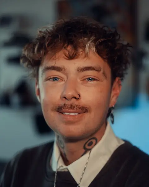
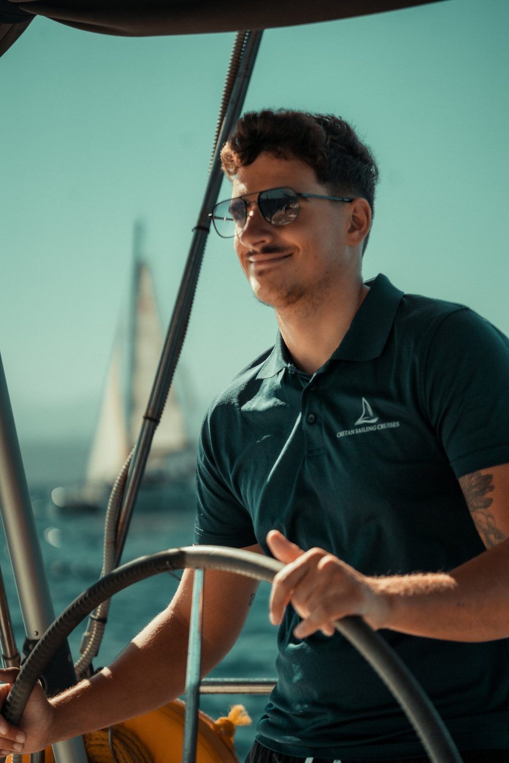
Teal and orange sit opposite each other on the colour wheel, so pushing shadows towards teal and highlights towards orange makes both look stronger. Skin already lives close to orange, which is why the look suits portraits so well.
Why the look works
Complementary colours separate a subject from the background without any extra light. A warm face against a cool sea, sky or street reads instantly, even as a small thumbnail. It is the same reason the look turns up in so many films.
Where it goes wrong
The risk is pushing teal into the midtones, where it turns faces grey or green. The opposite mistake is just as common: skin pushed so far towards orange that it looks sunburnt. Both come from treating the whole frame with one move.
Cool the world, protect the skin.
How I grade it
- Settle exposure and white balance first. A grade cannot rescue a frame that was lit badly.
- Push the shadows towards teal with the colour wheels or a curve, and leave the midtones mostly alone.
- Warm the highlights a little, just enough to lift the skin.
- Mask the skin and pull its hue back towards orange if the grade has dragged it green. Lower its saturation if it has gone too far the other way.
- Check the result on a second screen or a phone before exporting.
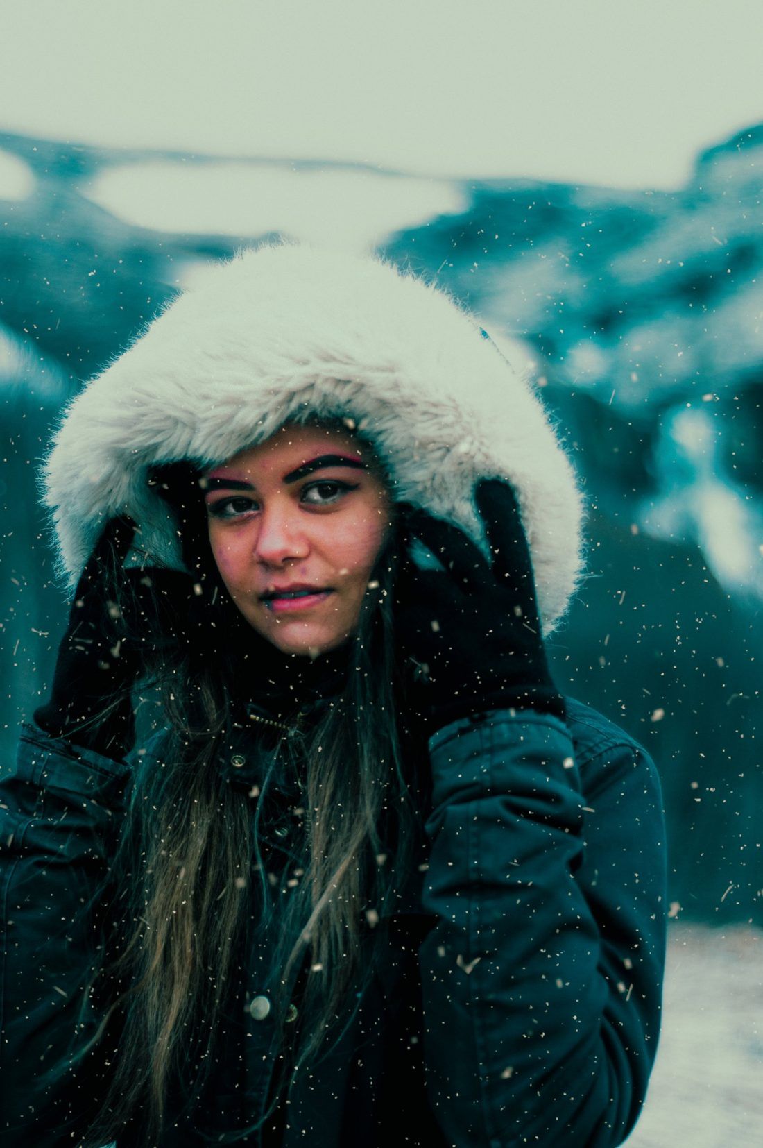
Grade last, and grade lightly. If someone notices the grade before they notice the person, it has gone too far.